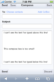
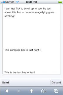
When composing a message on my phone, I really want to see as much of my draft as possible and make use of all the available screen space. One of my biggest gripes is a fixed-size compose box that restricts me to only a couple lines of visible text when my screen still has room to display more lines.
Today we launched auto-expanding compose boxes in Gmail for iPhone. This makes composing longer messages much easier since you're able to see more of the text you've typed. Just keep typing until you get near the bottom and then the compose box will magically expand by a few lines! As an added bonus, for all those iPhone users out there, auto-expanding compose boxes take away the need to press and hold to scroll with the magnifying glass! Instead, you can flick to scroll, much like you would normally do to scroll up and down a webpage. (On Android-powered devices, this hasn't been much of a problem, thanks to the trackball.)


While we're on the subject of making it easier to view content in Gmail, one more bit of news. We've been working on ways to make inline images show up in your messages, and you can now get some of those images to display by following these steps.
To try out, visit gmail.com on your iPhone/iPod touch (OS 2.2.1 or above, US English only) and create a home screen link for easy access.
by Casey Ho, Software Engineer, Google Mobile
ليست هناك تعليقات:
إرسال تعليق